
Who you vote for may be influenced by what you see. Graphic designers in the political science field must take a number of factors into account when creating campaign posters and protest signs.
In America, political posters act as a supplement to the advertisements that run on radios, televisions, phones and the internet. On the other hand, in countries such as Japan, posters are the primary tool used to promote campaigns by those running for office.
According to Nathaniel Smith, an assistant professor of East Asian Studies at the University of Arizona, “Japanese elections are highly regulated [with] no television and radio ads. Instead, for just one or two weeks prior to the parliamentary vote, there are public boards erected to feature similarly-sized posters from each candidate.”
RELATED: Civility a key election issue
In such a politically media-restricted country, Japanese graphic designers need to find a balance of creativity and sophistication if they want to draw the attention of voters.
“There is a distinct genre to graphic design, although there are sometimes whimsical departures,” Smith said.
To produce these genres, Smith said designers should know how to get into the minds of people.
Digital media marketer and visual design blogger Shyrose Vastani shared the applied psychological techniques behind graphic design to trigger emotions and build an audience in her blog. According to Vastani, “different shapes stimulate different emotions.”
Vastani’s blog said that circular graphics convey positive emotions and imply a sense of community, love and unity. Meanwhile, straight edges, like in squares, indicate stability and consistency.
Vastani said that colors convey similar effects to audiences, and each color conveys a different message. She shared that warm colors, such as orange, red and yellow, convey messages of love, prosperity and energy, while cool colors, such as purple, blue and green, symbolize tranquility, grace and nobility.
Psychological strategies such as these aid graphic designers in their conquest to create compelling political campaign posters. An American example of this is evident in Barack Obama’s 2008 campaign poster entitled “Hope.” The poster employs a balance of the country’s trademark colors of red, white and blue to symbolize unity.
Graphic designer Shepard Fairey, who created “Hope,” said in The Harvard Journal of Law & Technology, “I thought a good way to convey the convergence of red states and blue states was to illustrate Obama with a shadow dividing his face down the middle with blue tones on one side and red on the other.”
The use of such colors was aimed to create lasting impressions, as well.
“The benefit of illustrating an image in a few colors is that the high-contrast layers yield a very iconic image that looks like a statue,” Fairey said. “A statue suggests to the viewer that the subject is noteworthy enough to have earned such depiction.”
Japanese graphic designers use similar techniques to produce their political campaign ads. Smith pointed to Mikawa representative Satoshi Shima’s winning campaign poster as a prime example.
Shima’s poster received a lot of attention for its rather unique mix of colors and images. The photo revealed a picture of a white cat, named “Spence,” with one blue eye and one green eye in the background behind a smiling Shima. According to his Twitter, “If you find one of my white cat posters, you’ll be happy.”
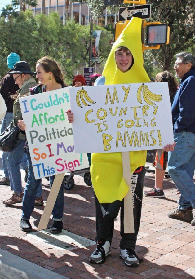
Creative design techniques are also vital to protesters.
“Right-wing groups in Japan often use posters as part of their activism [and keep them] pasted all over town,” Smith said. “Unlike candidate posters, they do not feature the face of a person but instead strikingly rendered slogans.”
The expansion of the internet and modern artwork has influenced the design techniques used in Japanese protest signs today, according to Smith.
“Graphic arts in political protest have a long history. What has been interesting to see in Japan is how certain mediums, like online art, memes and manga, have informed two- and three-dimensional political art in the ‘meat-scape,’” Smith said.
One example of a Japanese protest graphic design includes the logo for Students Emergency Action for Liberal Democracy, which used contrasting black and white backgrounds to emphasize images of powerful tools used in government, such as a megaphone, a book and a pen.
RELATED: What to expect at this year’s Homecoming parade
Despite the large amount of creative methods available to these political graphic designers, they are not invulnerable to extremist beliefs.
“The tricky part is that abusive and trolling slogans that might emerge easily in anonymous online forum have a very different feel when a real person has [them] emblazoned on a sign they hold in their hands,” Smith said.
While candidates and protests in societies like America and Japan come and go, the impressions created from their artwork provide a lasting impression in history. As Vastani wrote in her blog, “We as humans respond differently to different elements of design” – what we create now influences what we may see in the future.
Follow Mia Herrera on Twitter