
If an art exhibition can still be revolutionary in this day and age, the new show at the UA Museum of Art is it. Perhaps by chance, the artists have commissioned one of the most eye-opening statements in the contemporary art scene.
The Museum of Art’s “”School of Art Faculty Exhibition”” challenges our values about good art and authority, showing us in vivid detail the visions, personalities and flaws that make our teachers peers instead of simply superiors.
But even though they’re entrenched in power and command respect from art students, many suffer from the same stylistic, thematic and structural problems as their pupils.
But the art program at the UA is indeed diverse, and that is reflected in the exhibition. It contains not only paintings but also installations, sculptures, videos, graphic arts and photographs. And while all the works are technically from the contemporary period, styles range from 17th-century Hispanic retablos to modern concept art.
The Museum of Art’s “”School of Art Faculty Exhibition”” challenges our values about good art and authority, showing us in vivid detail the visions, personalities and flaws that make our teachers peers instead of simply superiors.
But while some pieces exude personality and push to the forefront of modern art, others seem dated and anachronistic.
Andy Polk’s “”Bodily Fluids,”” an enormous splatter painting in the vein of abstract expressionists like Jackson Pollock and Willem de Kooning, is colorful and grabs your attention but fails to be original or fresh. Abstract expressionism ceased being cutting edge decades ago, along with the Southwestern landscapes perfected by Charles Guerin, whose paintings are hung on the adjacent wall. While the technique may impress, the style looks like something you’d see at a furniture store or in a room at the Best Western.
Many pieces are stylistically modern but suffer from poor execution or a lack of creativity. Barbara Penn’s “”Her Voice,”” which takes up an entire wall, has all the concepts of a modern painting: nonsensical poetry, a disembodied face that resembles a graffiti stencil, large spaces with nothing but a single color that’s smeared unevenly. But there’s something missing. For such a large piece, it fails to grip you in any way. The whole thing seems hastily put together.
But because the exhibition has no theme or guiding force besides the “”faculty”” gimmick, there is a wide range of talents and achievements.
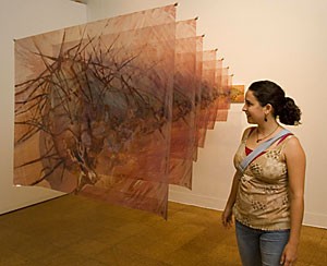
Dimitri Kozyrev’s “”Cutting Edge”” and “”Lost Edge”” are both technically impressive, visually pleasing and original at the same time. The paintings look like a sliced-up and re-arranged David Hockney work, but with ultra-detailed objects poking through the mess. The result is a group of paintings that force us to squint while trying to figure out how many dimensions the scenes are in and exactly what is going on.
The modern retablo piece is also visually stunning, because it updates a sacred tradition but recaptures the honesty and beauty of the original form. Made up of many panels, Keith McElroy’s “”Los Siete SeÇñores”” displays stigmata, dragons, hellfire, saints, skulls and many of the typical elements of mystic Christian paintings. McElroy recreates the style to a “”t”” but adds elements to indicate modern times, like a man wearing a sombrero holding a sheet embroidered with the Virgen de Guadalupe.
Some of the photography is also impressive, like Frank Gohlke’s desolate portrait of a dead tree that has so many branches sticking out, viewers may feel like they’re staring at the inside of a tumbleweed. But one doesn’t know what to think when they see the washed out “”Staring is Caring”” photograph by Ken Shorr of a man operating. Why do the huge silver letters stating the title take up the entire picture? Maybe he reveals that after the midterm.
It’s hard to judge such an eclectic exhibition on the basis of a few paintings, but after seeing it you get an encompassing feeling that good art can’t always be categorized and great art can never be taught.
At the very least, the exhibition will give art students some ammo when their professors criticize them, but at its best it will serve as a stunning critique of the people who devote their lives to teach the unteachable.