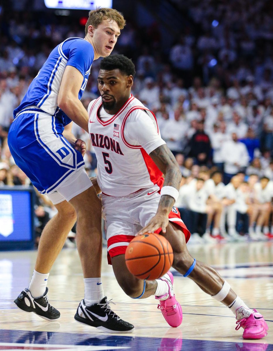
Arizona men’s basketball appears poised to return to the Final Four and beyond, and it now has snazzy uniforms to match the program’s recent renaissance.
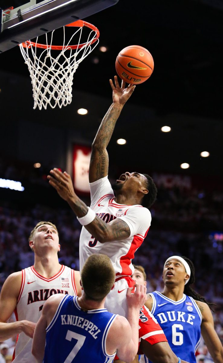
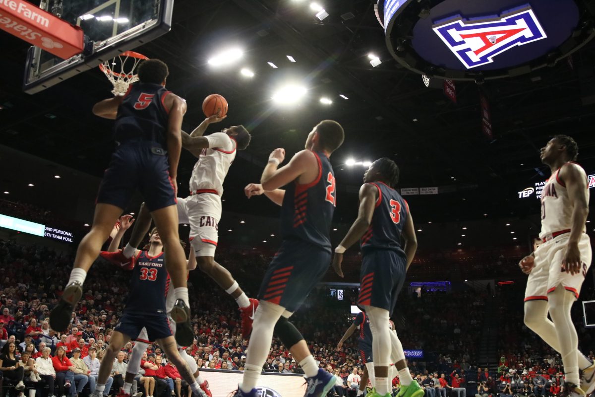
Recently, the UA debuted new uniforms that are an homage to the past with a modern design.
The new uniforms come in two white versions, a red version, a blue version and a gray version. Having two different white uniforms is rare for basketball or pretty much any squad besides Oregon or baseball teams.
The classic uniforms, which Arizona wore from 1995 to 2007 and that the new ones pay homage to, were red uniforms. Having two white uniforms is convenient to wear interchangeably between games. The new uniforms use red as the dominant second color and blue as the leading secondary shade, so the colors are more balanced.
UA fans have been clamoring for a return to Arizona’s 1995 to 2007 uniforms since the Wildcats’ awkward 2007 to 2011 attire debuted. During that span, Arizona won the 1997 national championship, finished second in 2001 and made it to three other Elite Eights and two other Sweet Sixteens.
The new gear is very much like those uniforms, but corrects a few little problems.
The collars on the new uniforms are better than last year’s uniforms and the mid ’90s-early ’00s because they’re more subtle.
The horizontal stripe on the shorts of the 1995 to 2007 uniforms was too thick and thus too distracting. The horizontal stripe on the new uniforms is more understated.
The other big change from the mid ’90s-early ’00s uniforms to the new ones is the mural on the back.
If you’ve never seen it, the mural is a combination of the Arizona flag and the old Arizona cactus logo that was on the court of McKale Center. The Arizona flag is a star surrounded by red and yellow rays, while the mural has the UA basketball logo in the middle of the star. The lower part is a cactus with a mountain and a basketball.
The mural was on last year’s uniforms, but now it is much easier to see because it takes up almost the entire back of the jersey. Before, to be able to see it, the players would have to in-bound the ball in front of you when you were sitting courtside.
An old design adage is “less is more,” but designs aren’t very effective if they can’t be seen.
The only knock on the new uniforms is that a few people didn’t like the gray one because it isn’t a school color. According to the UA’s July 2014 master brand guidelines, neither is white; it’s a “neutral color,” along with gray, and the neutral colors are meant to support the primary and secondary colors.
Copper would be better, and so would a visible reference to Bear Down, but gray’s a nice change of pace and it’s versatile. It can be worn at home or on the road.
The new uniforms are a good mix of the past and contemporary design. They’re an upgrade over the ’90s gear and last year’s.
—Follow James Kelley on Twitter @jameskelley520


