According to Tucson Museum of Art’s Chief Curator Julie Sasse, artists in today’s tumultuous times are struggling to find themselves and asking, “”Where are we going? Where have we been?”” These messages, according to Sasse, unify the talent of the state’s longest running biennial exhibition, Arizona Biennial ’09.
At first impression, this unification is unclear. Mirroring all of the mediums used within Arizona’s current artistic climate, it seems that the Tucson Museum of Art has done their best to cover them all: installation art, landscapes, photography, painting, sculpture – you name it, it’s there, represented by more than 40 gifted Arizona artists. Among the over 400 regional applicants, the chosen pieces coalesce to create a general conversation between current artistic trends and schools of thought from the art studios in Arizona.
The result of this open dialogue is not a neat divide, as show curator Tim Rodgers suggests. However, the quality of this year’s biennial makes it apparent that a lot of thought has been put into not only presenting the top tier in Arizona’s artistic community, but also finding a deliberate direction for what could have been a cacophony of ideas.
Visually, the exhibit is organized in a way that makes the art digestive: one area of the museum sections off various pieces that utilize a grayscale color palate, while another wall incorporates works with a clean, design-driven aesthetic. Mid-century influences like Rauschenberg and minimalism corral one area of art together. This organization is crucial to the success and coherence of the exhibition.
In speaking with Sasse, the collective voices in this year’s biennial combine into a few key themes. She said artists today are interested in systems. They study the correlation between technology, nature, Internet and science, as it connects both interpersonally and with oneself. To understand the patterns and systems in nature and technology, many of the exhibit’s artists have employed maps, diagrams and lines connecting various elements within their works. What Sasse said is true, as many of the pieces featured in the biennial, regardless of medium or style, employ not only literal pieces of maps and map markers, but also implied diagrams and heavy use of line. One artist even proclaims that he has abandoned realism to study line.
Jerome artist Alan Bur Johnson captures this idea of systemization in perhaps the most innovative artwork in the whole exhibition with his sculptural photographic installation “”Icarus,”” 2009. Based on his experience of seeing a large hatch of monsoon insects at dawn, Johnson pseudo-scientifically recreates the visual image of falling insect wings shimmering in the sunlight.
His creation consists of studious digital photographs of insect wings printed onto a thin clear material similar to what is used with an overhead projector. These images are framed with an austere, stainless steel-type metal. This material creates an unfortunate disconnect for the viewer, intellectually distancing the mind from the heart of his original inspiration.
To save the piece from completely being an isolated display of specimens, the photographs are pinned to the museum wall in a sideways tornado shape organized in color from pale yellow to deep red, an arrangement that communicates sonic and visual qualities of a gust of summer wind. Moreover, the images are pinned as loosely and delicately as the wings themselves, leaving the viewer wishing there was a slight breeze on the installation in order to see a flickering ripple of the wings that would have been seen during that special monsoon dawn.
Another branch of meaning one can take away from the exhibition is the idea of making the common uncommon. This is perhaps epitomized in a close-up photograph that puts cereal on a fine-art pedestal. “”Trix,”” 2009, by David Elliot, presents a super-sized view, crumbs and all, of what Sasse said is a commemoration of the “”joy, colors, shapes, and memories (Trix) evokes.”” This cereal celebration may be written off as a juvenile ode to the artist’s youth, but it is in this lighthearted nostalgia that “”Trix”” holds its charm, bringing the viewer back to simpler times.
A piece that goes a little deeper into everyday perception is Tucson artist Andrea Jensen’s “”Body Fat.”” In her abstract painting, Jensen poses the question, “”What does it mean to be in the world but not of it?””
Her choice of recycled billboard material as canvas is her first step toward making the common uncommon. She then utilizes this material, once a tool for consumer culture communication, to delve into what she perceives to be escapism in contemporary American consciousness.
Her work employs a muted, pastel color palette with some decipherable forms in nature like a diagonal ground line and shapes of branches. When reading the title with her artist’s statement – how when she is running, her mind goes into a kind of vacuum – one can imagine the many senses of what it’s like being inside a stomach during a jog. Seeing the world through the belly button view of “”Body Fat”” creates a feeling of insularity, not unlike listening to the sound of a seashell.
Finding the simple and beautiful can be comforting, Sasse said, as we live in an unsettling time where many artists are trying to find their place in a socially and politically convoluted, and often menacing, world. This concept is seen in not only the themes of systems, a sign that artists value direction, and reanalyzing the everyday, evidence toward artists’ nostalgia for simplicity, but also in a general downshift in blameful political messages.
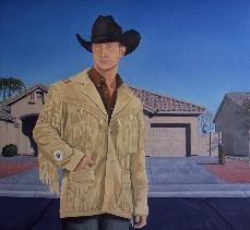
This isn’t to say that the biennial lacks sass. Though Phoenix artist Chris Miller’s technical ability isn’t extraordinary, the mediocrity of his painting skill combined with his clever cultural criticism make his two 2008 works, “”Southwest Accents”” and “”Western Front,”” among the most memorable of the exhibition.
Each painting is a semi-realistic portrait of the cowboy archetype, seemingly plucked out of a Western wear catalog. The handsome cowboys pose nonchalantly. Like good catalog cowboys, their broad shoulders, weathered faces and Marlboro man ruggedness sell the idea of adventure. The background provides the visual punch line: empty cookie-cutter homes that plague the outskirts of Phoenix. “”Western Front”” includes a real estate sign, delivering an amusing comment on mediocrity and irony within the fruits of Western conquest.
All in all, if you want to know what is currently going on in Arizona art studios, the biennial is worth checking out due to the great amount of talent and thought put into this exhibit. The specific direction of the artistic exchange may initially seem to veer off into many mediums and ideas, but at a closer look, the biennial reveals subtle shifts of artistic tendencies that fuse together to present the general language and message of contemporary Arizona art.


