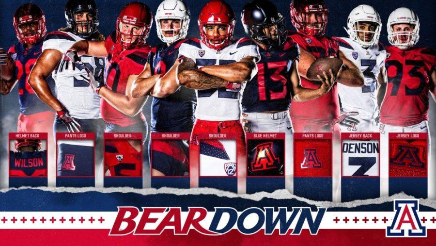
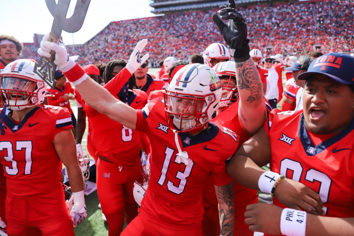
Arizona football is hoping that new uniforms can help the team rebound from last season’s dreadful 3-9 campaign. While the rejuvenated uniform template represents a new beginning, some popular design elements from previous eras remain.
College football uniforms have come a long way from the plain, workmanlike garb of the previous century. They’ve become more than standard issue equipment; they’re now billboards for programs. A program with a unique visual identity can leverage its look into success on the recruiting trail.
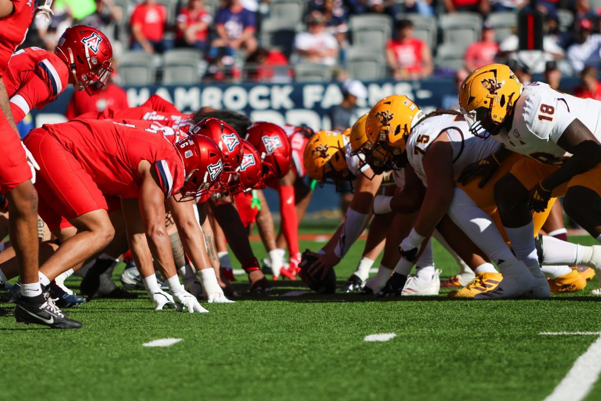
The Cats are known for their multiple helmet options, and like fellow Pac-12 member Oregon, chrome is a significant part of the design.
The popular red chrome helmets will live on and be joined by a matte blue helmet. The matte blue helmet features a chrome “A” for a distinctive look.

The classic white helmet also returns and again has no striping, something that has been a source of debate on social media.
While Arizona’s helmets are mostly a nod to the past, as its jerseys are brand new. The gradient sleeves are gone, replaced by shoulder stripes that feature red and blue elements. Red, blue and white figure prominently into the jersey designs, with each color serving as a base.

Unlike in prior revisions of uniform templates, the number font wasn’t carried over from a previous uniform. The new numbers are conspicuously oversized, and there are concerns about readability, especially with the darker jerseys.
The pants, in contrast, are plain, with only the Nike swoosh and the Arizona “A” featured on them.
As expected, the uniform changes have been a source of discussion on social media. A vocal minority has been critical of the new outfits, with some pointing out that the jerseys are gaudy. Most fans, however, have expressed satisfaction with the changes, even if the new look isn’t as clean and sleek as some prefer.
Follow the Daily Wildcat on Twitter.


